

 Submitted by Jordan on
This is a rant about the best-constructed website on the internet: Google.
This is the part where you laugh. "Surely you must be joking," you say. "They're so plain and boring. They use Arial, which you hate. Besides, of course they're simple. They only do one thing."
Nope, no, doesn't matter, no, and no. Google is a huge company that does a million things. The fact that you think they're so simple is what makes them brilliant. Just like Apple. But how did they fool you? Two very simple things.
Focus On Your Primary
Everyone knows what Google's primary business is: search. It's what 99% of their users come for, and it's 99% of their revenue. So, they emphasize it. It's not just front & center; it sits alone in a sea of white. You could be excused for thinking it's the only thing on the page.
Make It Easy
I'm not talking about search any more; I'm talking about everything else they do. From the home page of Google.com, you can get to almost every other service that Google provides, with one or two clicks. I'm talking about Gmail, of course, and Youtube, Google Maps, Google Play, Google Drive, and pretty much everything else. Even web professionals and business have everything at their fingertips, including Adwords, Adsense, and Google Webmaster Tools. One or two clicks.
Don't believe me? Here's a chart:
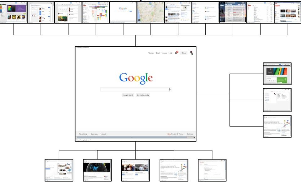
That might be hard to read. Go ahead and try it out.
The Holy Grail
I call Google the Holy Grail because it's the ultimate achievement in web design. This is true whether you're talking about design, layout, architecture, user interface (UI), or user experience (UX). Google.com is an incredibly powerful, feature-rich website, boiled down to utter simplicity. It's a level of enlightenment to which I have always striven, and which I have not yet attained. But I'll keep trying.
// rant over